Live Brief
Matt Painting
Savanah
Images used


Workflow


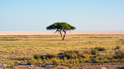
The image began with the foreground. I used the large clump of grass from this image to place in my scene and act as a cliff edge. I separated it from the original scene by using the pen tool to draw around the small part of grass. Once I had drawn around it Right clicked and clicked on Make selection Which then selects the area that I drew with the pen. I clicked on the Mask icon under the layer section. The mask icon is the square button that has a circle in the middle of it.


I then used the field grass land from the image above to act ad the main ground area of the scene. I wanted a large area of the scene to flow into. I separated the image using the same method I used for the first grass section of the image.

I added a colour balance to the field area to increase the orange in the image I did this as I felt that the image did not sit in correctly. I also want to make this image predominately warm colours to represent the heat. This is due to the savannah being an environment that is always exposed to extreme heat.


I cut out the Maintain and rocks on the right of the scene and placed them as the background of the scene. I wanted maintain to act as the focal point of the image. The maintain acts as the grand view of the scene and makes it feel much larger. I also used a colour balance and made the maintain lighter to blend it in with the foreground. Just like the field area I wanted to make the mountain area warm colours to represent the warm environment.

The rocks in the foreground did no however fit in well with the scene, they where to bright and simply looked out of place. So to fix this I duplicated the original image. Next using the mask I created for the scene I deleted the maintain in the background and placed the second image above the first image in the layers.

I added a colour overlay to the rocks. I only added a slight bit of orange. Adding the orange overlay and turning the Opacity to 20 so it would completely cover the image.

The next step was to add a family of elephants to the scene, I did this for a few reasons. The main one was to help add scale. Everyone knows that elephants are large animals and adding them lets the viewer understand the size of the image. Another reason for adding the elephant is because elephants are generally known to live in Africa. therefore allowing the viewer to understand where they are.

I then placed in the sky to the image. I placed this image behind the other images. I used this image as it imbedded in well due to the orange colour


This is the final image of my Savanah matt painting. The image is dominated by warm colours. I did this as in the savannah the environment is very dry and there is always extreme heat. Which the Warm colours show very well.
Breakdown
Marshland


Workflow


I used the the pen tool to draw around the stream. Once I had drawn round the whole thing I right clicked and clicked on Make selection this selects the area that was marked out with the pen. I then clicked on the mask button, this is the square that has the circle in the middle of it. This then cuts out all the area that was not selected. However, the deleted parts of the image can be retrieved with the paint brush. I used the paint brush to feather the edge. of the river. I did this to get rid of the hard edges therefor it wont look out of place when I placed in another image.


Next I added in a house to the scene. I added it using the same method as before, using the pen tool and making a mask layer. I wanted to add in a house to make sure the image does not feel empty. I feathered the edge of of the grass and used the slight edge on the stream to make it look like the grass is part of the drop.

I used the stamp tool to get rid of the tire tracks. I did this as it did not fit in with the image. The tire tracks went in the direction of the stream and did not work well with the stream.

Next I added in a colour balance and a hue and saturation. This allowed me to darken the green grass as I felt it was too bright.


Next I added in the background to the whole scene. There where a few little bits of editing I had to do to this image. First I used the pen tool to draw around the the edge of the cliffs I did this as I did not want the sky from this image. I then created a mask layer to delete the sky.
Next I had to use the stamp tool to get remove the text that is in the image. Luckily the text is over dark areas of the scene. This made it easy to cover it up as all it had to do was cover it with the dark areas, instead of the green patches of grass with would have been a lot harder to look real due to the different colours and the lighting on the grass.

I blended these three images together by using the dips and drops within the images to act as the edges to the stream and the edge to the grass land of the house. This works well as it gives me a area to work with and blend in the areas by feathering the edges.


My next step was to add a mountain into the background to add depth to the image. I used the Pen tool to to draw around the image and then created a mask layer to cut out the sky.

The cliffs in the background where very bright, therefore I added three adjustment layers. These being, Colour balance, Brightness/contrast and Hue/Saturation.
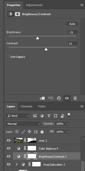


These are the adjustments I added with all there settings.

Due to the mountain being far I needed to add fog as because there is moisture in the atmosphere the further way something is the more foggy it gets.

The final step was to add dark grey clouds to the scene. I wanted to add in dark clouds as due to it being marshlands the weather tends to be rain and storms.

This is the final Image of the marshland. I have used a lot of greens in the image as marshlands are very lush and full of vegetation due to the damp atmosphere. I added the stream at the front of the image. I did this so when the viewer sees the image there eyes will follow the flow of the river and will see then see the house. I wanted to place the house in the middle of the scene so it can be the main focus point of the image.
Breakdown
Blade Runner: City
Images i have used


Workflow

This is the base image I began with. Reason I used this image is it was good for a base due to the fact it showed people with umbrellas to show rain also there are many reflections on the floor that I can work with. Bladrunner is based in Tokyo which is a very rainy country and there are many lights. Both water on the floor and lights work well due to the reflections that will show up in the water.


I began by replacing the right side of the scene. I did not want the two cars in the image as when I originally tried to fit them in it simply did not look right. Therefore I made the decision to take them out completely. I did this by using the pen tool to draw around the cars and the buildings on the right. I then clicked make selection and created a mask layer. My next step was when I placed the right side in I drew the areas that where overlapping it out using the mask layer.


Using the pen tool I then draw around the first Section of the shop in this image. I the flipped it and placed it on the right side of the image above. Using the Mask layer I blended the edge of the two images together by changing the opacity of the brush I used.
I used this image because I felt it complimented the first image very well with its different colours With the use of both warm and cool colours. I also liked the way the bright light under the covering helped outline the shadow of the person with the umbrella
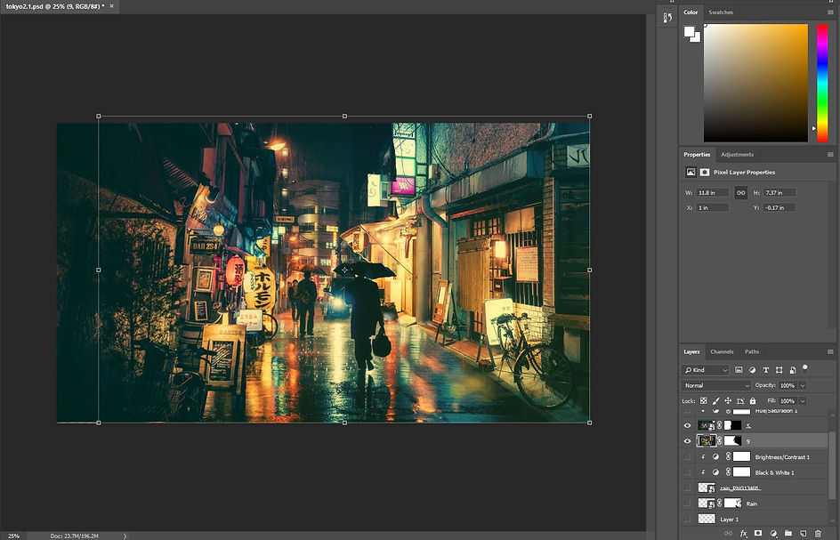

On the left side I wanted to replace it with another image. The image I used was an image of a building with signs and lanterns next to it. I used this image as the two images where taken from the same perspective therefore it was easy to imbed the image in.
The lights also worked well with the reflections already in the image. isolated the left side of the image by drawing round it with the pen tool. I then right click and press Make selection. I then make a mask layer to isolate. I then placed it on the left side of the photoshop image.


Next I added rain to the right side to imbed the image in. I made this rain by getting an PNG image online and edited it within a separate Photoshop document.

Within this document I duplicated the original image and placed them together to make a bigger image.

I then made a separate layer and added in the reflection of the car headlight on the side of the wall. I tried to copy the reflection that is in the original image on the car. I understand that the car is metal and the wall is not so therefore the light will interact differently but it was the only reference I had. I made the reflection but selecting the brush on the layer I made. I painted it in white at first as this was the easiest colour to change later one if I needed to.

I reduced the flow to 13% on the brush. This gave a better glow effect. I then layered on the brush going over the same area to make the reflection. I tried to replicate the light the best I could.
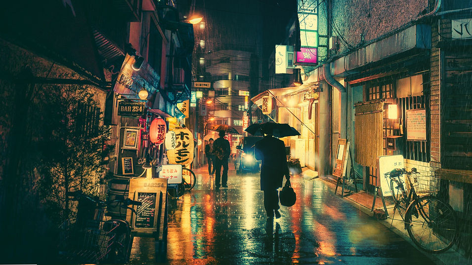
Here is the final image. I think the two images I placed in fit into the scene very well. There is a good mix of warm and cool colours in this image. The warm colours all come from the lights and reflection in the puddles on the floor. This image represents Tokyo very well as well due to the wet floor, the rain and all the lights.
Breakdown


Wall-E
Moodboard

Colour Pallet


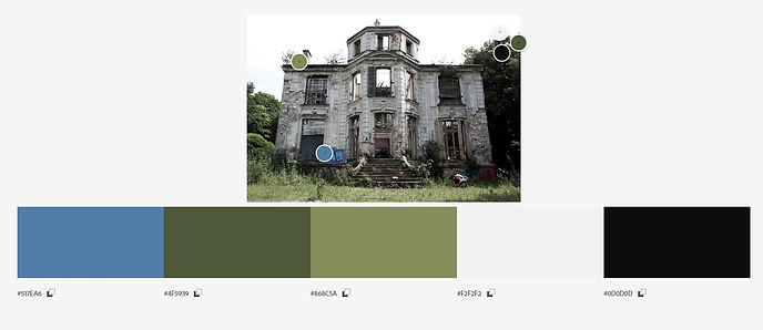
From the images I added to my mood board i was able to take some into Adobe colour and create mood boards to show the colours I would end up using. The mood board I preferred the most was the middle one as it showed the colours i wanted to use the most.
Early draft

Within Maya I set up an early plan for my scene. I wanted a house on a street with an open field behind it Then in the background I was going to place in a destroyed city This would be made within Nuke. The cube placed in the scene is the area where I would place modelled assets.
Main draft - Scene

This is the main draft that I went with. It is a scene I made during the summer but never completely finished it. I liked this scene as it can easily fit into a city scene and can be easily made to look destroyed.
Main Draft - Shot
A zoom long shot is the shot I was looking at making, therefore it can move through the scene and show off the models.
Modelled assets
All of these Assets are ones that where created by Me and Ryan. I did the modelling and Ryan did the texturing and Uving
Slide and swings

This is the image I used for reference for my slide and swing set. I liked it as it is exactly what I was looking for due to it being abandoned.


This is the slide and swings set. The top image is the model without textures and the bottom is with the textures added. The model was created and Uved by me but was textured by Ryan Clark within Substance Painter.
Seesaw

This is the the image i used for a reference for the seesaw. I used it for the basic shape rather then the shape and texture.


This is the model that I made for the scene. I modelled it within Maya and Ryan Clark Uved it within Maya and textured it within substance painter.
Bin
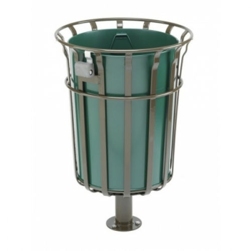
This is the image I used to model the bin.
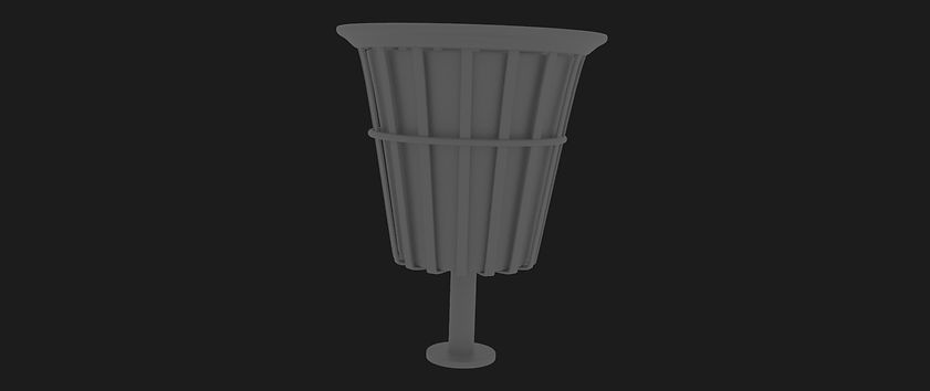

This is the Model and Texture for the Bin. I modelled the bin and later on Ryan Clark Uved and Textured the bin. I put my own twist on the model. I didn't like the square shape of it so i made it a bit more slopped down the edges.
Fence


Rocking horse

This is the image I used to get the shape of my rocking horse.


I modelled the rocking horse using the the image above as reference. Ryan then Uved the model and textured it within Substance Painter.
Roundabout

This is the image I used for the roundabout as a reference.


I modelled the Roundabout and uved it for Ryan to then Texture it.
Flag

This is a mesh that will later be added to a flag. Texture made by Ryan.
Rendered scene

This is the scene all added together, there is also a floor plane added into the scene that was made and textured by Ryan.
Test Grading and Fog
Here is a very early test within Nuke. Showing how the background will look, how the scene will look and how the fog will look.
Ncloth Test Flag and Paper and movement of assets
This is a shot that shows the Ncloth paper and flag. I mad this by take a plane and applying
Ncloth Flag

Within Maya I created a Plane. I applied an Ncloth to the plane and attached it to the flag pole I made. I attached this by creating a point restraint. I did this by going nConstraint > Then point to surface, this attaches the flag to the pole. Next I played around with the settings of the Ncloth so that the flag moves around like a flag. After this I added in a Volume Axis from the Field/Solvers tab. This allowed me to mess around with the wind and get the flag moving in a direction I wanted.
Poster

This is a poste the flies through the scene. This was made the exact same way as the flag except the poster is not being restrained to anything. Due to the poster flying through the scene I had to apply a collider.
Bench


This is a bench I made and Uved. I then passed it to Ryan so he can texture it.
Final render out of Maya
Due to criticism on the test nuke render we changed some things. The camera was higher in the shot, some of the assets where placed closer to the camera and we added in the bench to act as a super close object.
Nuke

I began with placing in the sky for the scene. I added a reformat node To make sure the image was in the correct format. I added in a transform node so I was able to move the sky in any way i needed. Finally I added in Grade nodes to adjust the colour.

Next I added in a picture of new york. I added a reformat node and Transform node. A grade, toe and finally a filter erode. I added in the grade node to adjust the colour and set the city further back into the scene.

This is the image of a broken city that I added into the scene. I did exactly what I did with the previous set of images with new york.
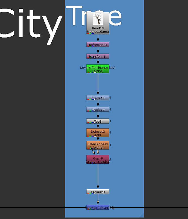
Next I added in a tree. I added a reformate node and a transform node to adjust the position of the tree within the scene. Next I did what I did for all the previous images by adjusting the colour of the tree to make sure it sits into the scene.

I added in a row of bushes to layer the back of the park. I used the save method that I used with the previous images However this time I used a Keyer because the bush image had a white background. The keyer is what I used to get rid of the white background.
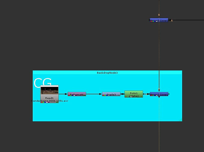
Then finally the CG scene. I added a reformat to this to make sure it was the correct size with the rest of the shot. I added a grade node to adjust the colour of the main scene to fit it in with the rest of the scene. I also applied a roto which will be later be used by Ryan when he adds the dust particles.

Here is the roto I added to the bench. I keyframed it throughout the scene, to make sure it covers the whole scene.
Complete script

Here is the whole script.
Nuke Work put together

This is my Nuke work put together.
Ryan Nuke work

Ryan Used the noise node to apply dust to the scene. He used a grade node to change the colour of the dust to a yellow colour. To create an effect of sand flying around the scene.

Next Ryan created dust in the background to create depth within the scene. He did this by overlaying multiple noise nodes. He added a roto to the floor of the scene so the far dust does not look like it is effecting the front of the scene.

Next Ryan added in small dust particles to the scene.

Ryan took the roto that i made earlier on and applied it to the far dust so it does not move over the bench.

Ryan also applied the images I added before to cards. As the images I made before all looked flat. Adding in cards means the scene looks 3D. Ryan also tracked the scene meaning all the images and particles in the scene stay to where they are.
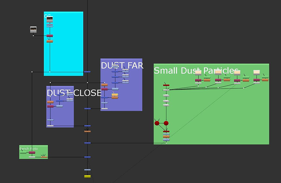
This is the complete pipeline of Ryan's work, Plus a camera projection above this image.
Complete pipeline

Final Video
Breakdown Video
Christmas Advert
Pre production
Idea 1

This is the idea that we will most likely go with. In this shot we will have a full CG character placed within a live action plate. There will also be decorations placed around the shot aswell.
Idea 2
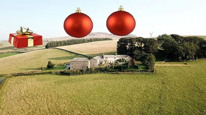
The second idea is to have large ball balls in the distance of a drone shot.
Idea 3
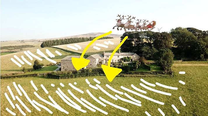
The third and final idea is to have the drone shot and have Santa fly towards the shot whilst having snow covering the floor.
Moodboard


This is a mood board that is a collection of images to gives us an idea for what we want to create. We got images of ball balls and full living rooms full of decorations. We have an image showing what we want the monster to be based off.
Storyboard


These four images are the original storyboards for our Christmas advert. We then selected one that will be the one that we work on. This being the last shot of the sequence.
Early Concept
This is an early layout of how the shoot will look. The cubes are there to show where objects would be.
Base Footage
This is the footage that we are gonna use for the scene.
Creature Concept
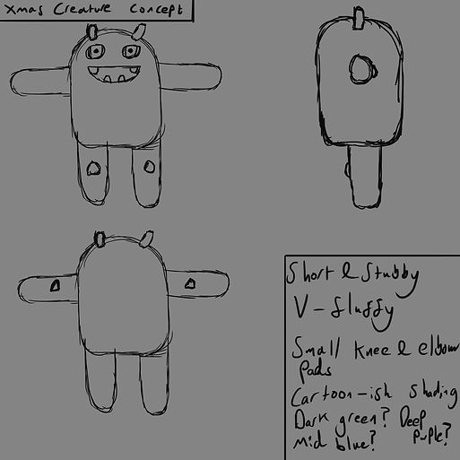
The monster creation
My main role in this project is to create the monster. So create it in Zbrush, use Blend shapes to give it expressions and finally rig and skin the model within Maya so Alex can ad fur and keyframe the creature after he puts it into the scene.

I started the creation of the monster by appending a sphere and reshaping it to make the head longer. I ten created the mouth. I did this by digging out a large whole in the middle of the face. I then use the standard brush to build up the lips around mouth.

Next i created the rest of the face by digging out two holes in the top area of the face. I added in a sphere and then sculpted round the eye to add the eye lid. I built up the areas above the eye to create eye lids. I also added in horns and cheek wrinkles.
Here is a video of my early production of the creature. In this video is shows the process of me making the face and adding the arms.


This is the early development of the monster within the scene of the advert. I showed my tutors this version of the monster and I got some feedback. The feedback I got was the legs where two long and having knees overcomplicates the rig. Also the eyes where not blinking correctly so i got feedback on how to do this.
After feedback


After some feedback I changed the shape of the feet and made them short and stumpy. Giving him a cuter look. I also added in teeth within the mouth and also added in a tongue.
Blend shapes
I added in Blendshapes. This mini animations on the mesh of the character that allow you to then animate it later down the line. I did them within Zbrush.
Tongue

I added blend shapes to the tongue I gave it 4 different movements.

The first movement i Used the move brush to move the tongue to the right.

I also added a blend shape which moved the tongue to the left.

I also moved the tongue upwards.


I also added in a blend shape to move the tongue forward. I did this so the tongue can be moved out of the mouth if it is needed.
Face and body Blendshapes
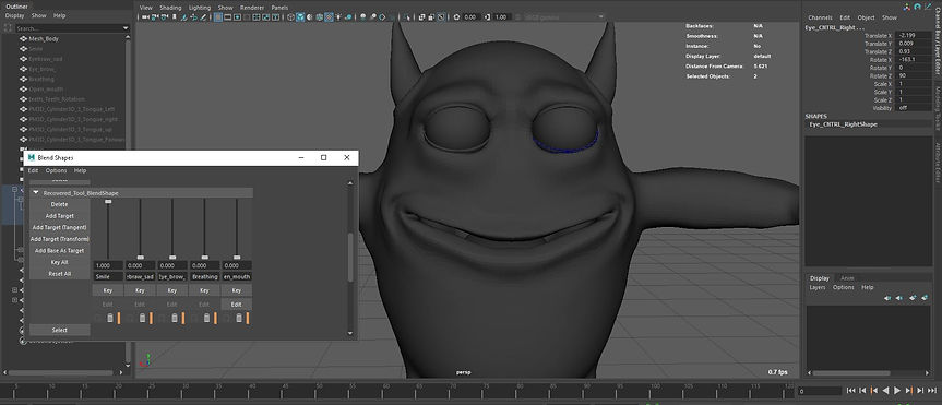
I moved either side of the mouth to create a smile.

I then moved the outside of the eye braw down to give a sad look.

I moved the eyelid down in the middle to give the monster an angry look.
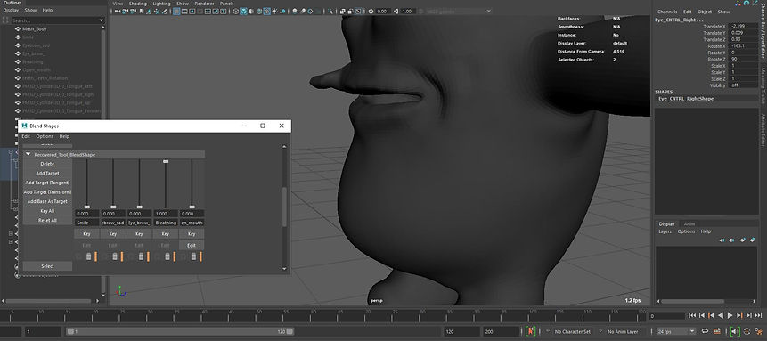
I added in a blendshape to the stomach to make the character look like it is breathing.

I added in a blendshape to open up the mouth to make it open.
Teeth

I added a rotation blend shape to the teeth which allow them to move up and down when the mouth opens.
Joints

I created the joints within the model. I made the spine first and then created each the arm and leg joints. Once both the limbs where made I Mirrored them using the mirror tool within the Joint tab.

This another angle of the joints.
Eyes

I added spheres as the eyes and used Circle nurbes to control the eyes. I did this by selected the eye and the circle nurbes and added an aim constraint.

I created the eye lid of the eyes within maya as well by duplicating the eye ball and splitting it in half. I then increased the overall size and rotated it up and down.
Skinning


I added skin weights to all the joints to all the model to be moved and placed in any direction it wants. This way when I handed it to the next person it is easy for them to use. To skin the joint the would select the joint and then the area around the joint, then I clicked flood. Then the edge of the skin I need to smooth into the next area around the joint to smoothen out the movement of the joint.
Stocking


I made this stocking in Maya I used a reference image of a stocking I got on the internet to make it.

I then took the model into substance and applied a material.

Here is the stocking with just the colour textures applied to it. I I tried to apply the other textures by maya was a not letting me.
Ryans Work
Ryan created 3D assets like presents and ball balls for the scene. He also textured the monster and was the compositor.

Ryan Modelled and textured these ball balls which will be used on the trees as decoration. He also texture them as well within substance painter.
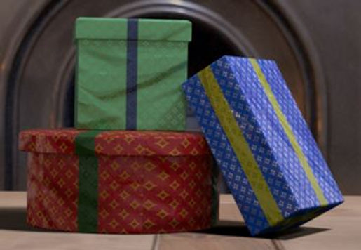
As well as the ball balls Ryan also modelled and textured these presents within substance painter

Ryan also did the composition within Nuke. He took all the renders that Alex did and combined them all together.
Check out Ryan's work here: https://ryan02764.wixsite.com/portfolio/live-brief
Alex's Work

Alex Made and textured the Christmas tree that you see in the background of the shot. He also created a wire which will later act as the lights for the tree.

Alex then added the lights around the tree. Which he added around the wire.

Alex also recreated the scene to add in the lights and shadows into the scene. Recreating the scene makes it easier to add in other assets and get realistic lighting.

Like I said before Alex added the lighting into the scene and corrected it to that of the actual footage. This way the lighting on the assets added will match the scene perfectly
Be sure to check out Alex's work here: https://alexcharilaou.wixsite.com/mysite/live-brief
Breakdown
This is the breakdown of the workflow of the final shot. Showing all the different assets and textures added throughout the scene.
Final Footage
This is the final shot
Wendigo Horror shot

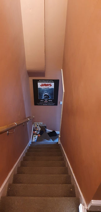


These are the early concept ideas for our Shot. The original idea was to have the wendigo sitting on the roof of my staircase as the area was very spooky and had little light. However this will be changed later on.

Here is a very early wendigo design, here i had only just sculpted out the ribs.
Creature


I worked within Zbrush and began sculpting away at the creature. I used the Standard, Move, Dam and Build up brush to work through this. I used various source images for wendigos found online to use a reference. The one that I was basing it off is a old wendigo that is seen within the PS4 Game Until Dawn.
After feedback

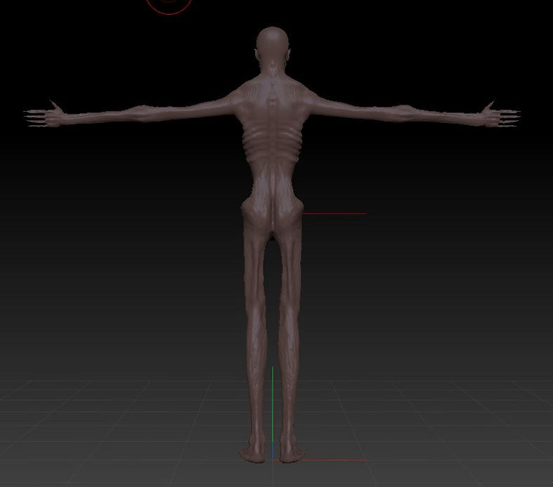


During a lesson with my tutor I was given some advice to make the wendigo look better. I was told to move the Back lattes in towards the body as they where very wide. Also The shoulders where to big so I moved them in further and finally I to help with the skinning process I was told to make the hips wider and the gap between the legs bigger. All of these things to make the wendigo look better. I also added in fangs in the mouth. I did this by using the Snake fang brush. This pull the area up in a sharp fang area.
Low poly Tringle


Although the high poly has a lot of detail, to skin and move around in Maya the polygons need to be lowered. I did this by using the decimation master tool.
Quads


Projecting the high poly to low poly

I then used the Zremesher to change the polygons to quads. This however loses a lot of information but this will be sorted out in the next step.
This is the low poly model. I projected the high poly which was around 2 million polygons to a new mesh which was Zremeshed and had the original information projected back onto it.
Blendshapes


I created 5 blendshapes. The first one is the opening and closing of the mouth. The second one is the braw moving up and down. The third one is the the braw moving up further then the first one. The fourth one is a snarl and the final one is the rib cage moving out to show breathing.
Monster rigged and skinned

IK Handles and pole vectors
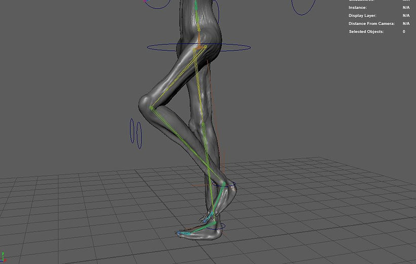


The rigging and skinning of the wendigo is one of the most stressful things I have ever done. However, I got through it and learned a lot. I ended up enjoying the process and wanting to learn it even more. I found it difficult as some layers like the shoulders and chest layers did not want to work together and I had to restart it four times. What made this even more stressful Is I Had 6 days to sculpt and rig the wendigo. Once I had skinned the wendigo I added a rig. I didn't have time to make a super complicated one so all i did was add in Ik handles to make it easy to move the legs and arms around.
Texture
Here is a textured model of the wendigo i made. It was textured by Ryan Clark.
Final Shot
Here is the final shot
Breakdown
Showreel
Josh class
In this class Josh a compositor who works within the industry came in and taught us how to use nuke and helped us through are own pieces of work.

Here is the final shot, I began with a guy holding a gun in front of a green screen and our task was to put him into a scene. It began by putting in a reformat node. This makes the image into the correct size that I want it to be. I added a crop node. and final a transform to increase the size of the image to get rid of any part of the image that is stretched out. Plus I placed in the tracker.

I added in a despill node this is done after the key section however I will explain it now. The despill gets rid of any green screen that is reflecting onto the scene.

This is where I added the key to the scene. I began with the saturation. node this is there to change the colour of the scene same with the Grade. the key light is the node that gets rid of the greenscreen.
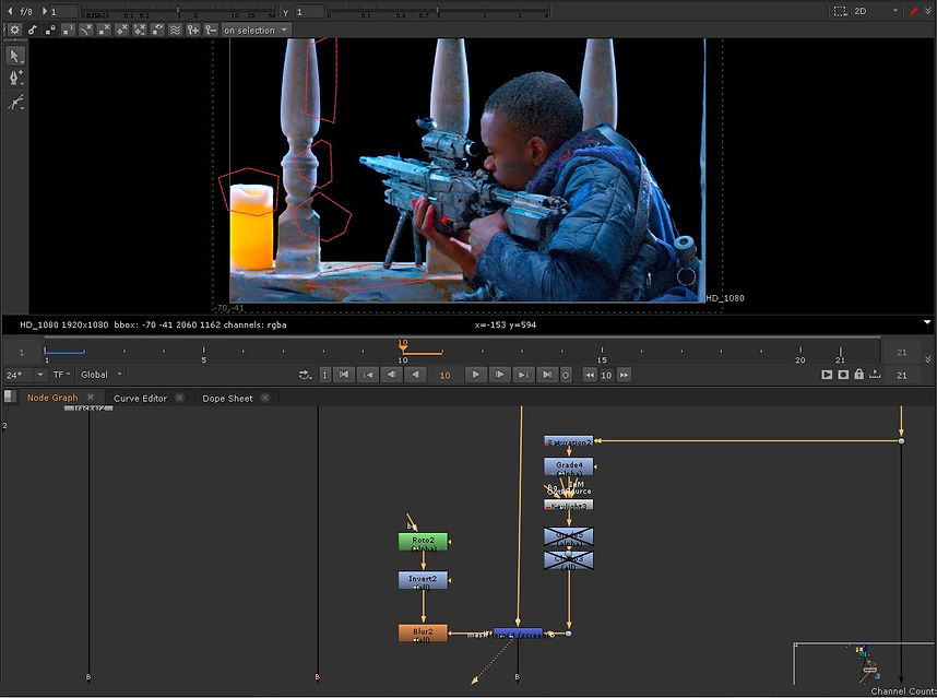
Here I have added in a second keylight. This is connected to a Roto which highlights the areas that where not keyed correctly.


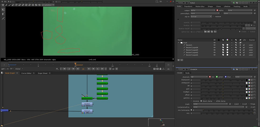
This here is a diffrent way to get rid of the green screen. Using mutipe IBKcolours I am able to get rid of the front front area of the shot and keep the green screen. The front of the shot can then be projected onto the background.

I have added various rotos to the screen to darken light areas of the scene that I want to change to dark.

Next I have added in a grade to the screen to make it darker then I thought it should be.

Here is the complete pipeline of the first half of the work.

Next I began on the background of the shot which included the smoke and the buildings.

I added in smoke to the scene. I added in keylight which gets rid of the green screen. I then added in a grade node. this helps change the colour of the smoke and change the gain. The second grade helps me change the colour of the overall smoke. The toe node is what helps the smoke sit into the scene. That is then connected to a copy which loops round from the retime node, this reloop contains another keylight to get rid of anything that is left by the original one. the copy is then connected to the premult node. I then connected it to a reformate and transform node which helps make sure them image fits in correctly.


Both of these smokes work the exact same as the previous ones. except each one may need a few extra tweaks done to it.

I then added in the dust. I used this by adding in noise which is like a static screen. I added animation to make it move to the right. This made it look like it was being blown by the wind. I added roto to each one so I could direct it around objects and where I want it to be. Then connected to this I added a grade which allowed me to change the colour to that of sand.

I then added in Multiple grades to change the back ground to the colours and brightness. I also added a blur to make it look more in the background.

Here is the overall pipeline.